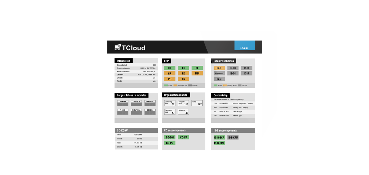
As part of a prototype project for Schneider-Neureuthner Partner AG (SNP), we have explored how complex information can be intuitively represented and used.
On behalf of its customers, SNP is carrying out SAP transformations, during which detailed insights into customer systems are required. In large companies, SAP systems create complex, linked structures which vary in different ways depending on the angle and task in hand. These structures cannot be easily illustrated with simple, tabular representations. Therefore, they do not facilitate intuitive access and do not demonstrate their effectiveness in the transformation process adequately.
We have implemented three measures in the prototype that allow structures to be represented more clearly and used more effectively:
- Using a modern, information-centred layout supports detecting relevant information quicker.
- Use-case oriented aggregations reduce the wealth of information and only present the details germane to the current task.
- Interactive tools structure the information separately for the respective context. They offer options for changing perspectives and for focusing on specific aspects of currently relevant structures.

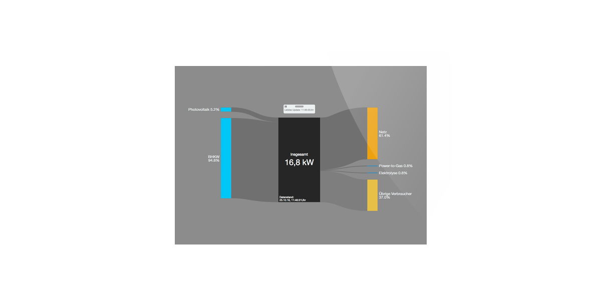
The Competence Centre for Renewable Energies and Energy Efficiency (CC4E) located on the Energy Campus at HAW Hamburg is developing sustainable solutions for society’s energy problems. In a smart grid laboratory at the institution, efficient and intelligent strategies are being developed and tested to analyze the interaction of energy production, consumption and storage. As part of the hackathon “What the Data!?” hosted by Cybus and Dezera, we built a basic system for monitoring energy flows in house.
Electricity is generated on campus using photovoltaics and thermal power stations. If the current consumption is higher than the generation that moment, the difference is covered by the building connection to the electricity grid. On the other hand, electricity can be stored in the public grid as soon as the current generation exceeds actual use. Our live visualisation shows the current relationship between supply and consumption.
The energy campus data is read out using Cybus middleware and provided from a MQTT broker. Reshin subscribes to the relevant topics of the broker, stores them for historical access and uses them for various visualizations.
visit Reshin
Wie können wir Ihnen helfen?
Flexible dashboards for companies – Reshin visualizes your data quickly and individually, and it is accessible wherever you are: in the office or mobile.
Reshin is based on Elasticsearch, Logstash and Kibana – thoroughly tried-and-tested tools for use with big data – and it also offers user administration and data management. You decide which data to import and who has access to it.
There are many use cases for Reshin:
- Log file monitoring
- Infrastructure monitoring
- Excel dashboard replacement
- Data analysis
- Internet-of-things
- Web tracking
In Reshin you have a tool that supports all your visualization requirements.
We have developed industry solutions for publishers which cover everyday analysis needs and allow flexible expansion. For example, the IVW dashboard reduces the effort of daily IVW tracking to just a few minutes. [IVW = German Information Association for the Establishment of the Distribution of Advertising]. And click tracking provides live information about the traffic on your website.
visit Reshin
Just another WordPress site

